Ritchie invented automatic watering in 1921 and has continued to be the innovation leader in the category. They felt the need to reintroduce themselves to a changing market and promote their better-built products to a new generation.
The Ritchie brand program was built to highlight the benefits to both animals and their owners of having clean, fresh water on demand. The program and campaign rationalized the line of products to the user’s needs and promoted the Ritchie brand promise: Fresh Water for Life.
(Project designed while working
at Stewart & Associates)
Doing business without advertising is like winking at a girl in the dark. You know what you’re doing but nobody else does.
—Stuart H. Britt
In other words, you could be the best company in the world but if no one knows about it, you’re toast.
Effective advertising reaches people on an emotional level or it is worthless. Make them feel something; happy, sad, smart, irritated…something. That way your message will be received and remembered.
Brand Strategy
Logo Design
Web Design
Apparel
Vehicles
Signage
Tradeshow
N. Glantz & Son is a sign supplies distributor founded in 1906 by Nathan Glantz. It is now in the 4th generation of family ownership and was long overdue for a brand rejuvenation. The look was dated, the messaging inconsistent, and the brand promise absent.
After compiling the needed data on the industry, the company, the competition, and the customers, a foundation was created, a brand promise written, internal improvements put in motion, copy direction and messaging established, and the design elements created. The new brand launched in 2019 with much internal gratification.
How can you read the intro to a joke and not keep reading? You can't. That was the idea behind my "joke" campaign. It was designed to get people engaged with the message before they even realized it. I wanted to draw people in, get them thinking and awaken their compassion.
The Coalition for the Homeless needed a brand identity and an awareness campaign. Along with the branding, I also created a budget-friendly guerrilla awareness campaign which volunteers put up periodically in different neighborhoods. It proved to be successful based on the positive feedback and increased donations and volunteers.
(Project designed while working
at Stewart & Associates)
Merck MORE is an internal program that assists Merck retailers through education, training, special promotions, and sales tools. I named the program and created all of the branding elements.
(Project designed while working
at Stewart & Associates)
A few examples of photography and direction.
Web Design
Logo Design
Apparel
Business Forms
Signage
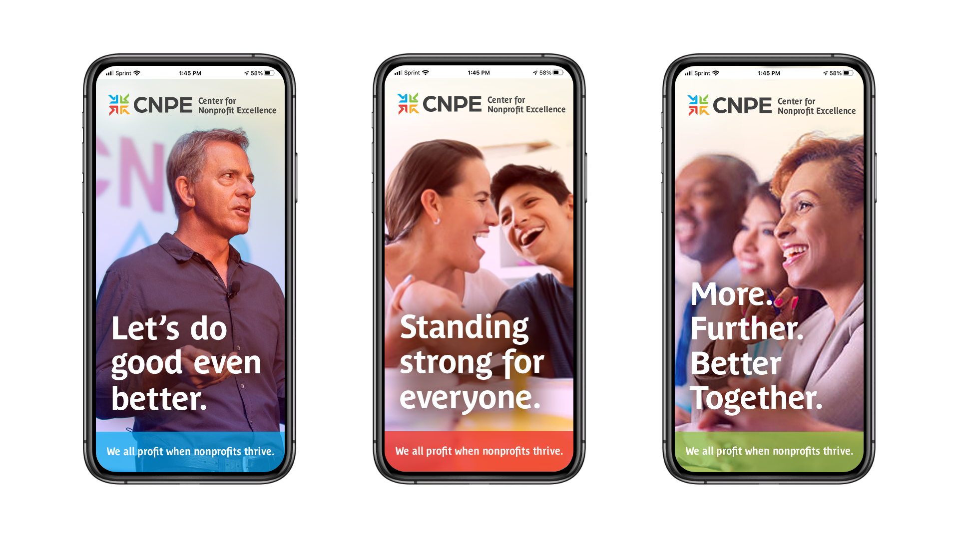
CNPE is a member organization serving the Metro Louisville area and Southern Indiana. It was created expressly to help nonprofits achieve their missions more effectively and with excellence – from getting started through strategic planning and resource development.
Amberley Snyder was a champion barrel racer who became paralyzed from the waist down from a horrible car crash. That didn't stop her. When she got out of the hospital, and went through extensive rehab, she got back on her horse and continued racing. She also decided to use her story to inspire others and has embarked on a promising motivational speaking career. She was featured on the Today Show in 2016.
I had the pleasure of creating her brand identity and writing her messaging.
http://www.amberleysnyder.org
(Project designed while working
at Stewart & Associates)
I wrote and designed these large-scale installation graphics for the American Advertising Federation Awards Show (then known as the Louie's) in 2011.
The logo is the point of entry to the brand. They engage in intelligence, imagination and emotion in a way that no other learning does.
I create 3D renderings to help clients visualize packaging, tradeshow displays, store displays, and many other things. They tend to love it.
With confusion over the company brand due to its use of three different category names; Wil-Deck, Wil-Gard, and Wil-Lift, a unifying approach was needed to position the company as the single, heavy-duty and cost-effective choice in their industry.
By dropping two of the names and delivering a single, cohesive brand mark, tag line and awareness campaign, this rebranding positioned Wildeck as the premier manufacturer of facility space enhancement, material handling, and protective guarding products.
(Project designed while working
at Stewart & Associates)
This was intended to be a fun campaign to promote locally owned Korrect Optical. Unfortunately, it was intended to launch around the same time that controversial statues started becoming a big issue so it was shelved.
Package Design
In-store Display
3D Renderings
Activyl's package was boring and bland so I gave them power and freshness with a new package, color system, in-store merchandising and marketing message for their flea treatment for dogs and cats.
(Project designed while working
at Stewart & Associates)
Web Design
Logo Design
Mascot Design
Apparel
Vehicles
Signage
Tradeshow
While Pluto Corporation as it’s known today began in 1963, the true origins of the company date back quite a bit further – all the way to 1913. The company is headquartered in French Lick, Indiana, home of the world-famous French Lick Resort and an area known known for its naturally occurring mineral springs whose “miracle waters” were believed to have healing and therapeutic properties. Pluto manufactures, blends and bottles household liquid cleaners and fulfills excess and custom run manufacturing needs.
They suffered from an outdated brand identity, lack of promotional materials, and a bad website. Check out their new site here.